
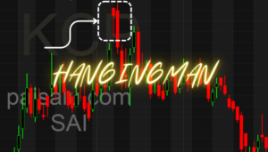
A common technical analysis technique used by traders and investors to examine price movements of financial assets like stocks, currencies, commodities, and more are candlestick charts. A visual representation of price movement over a given time period is offered by candlestick charts.
The construction of a candlestick involves four key price points: open, close, high, and low. These data points are used to create the distinctive visual representation of a candlestick chart. Here’s a step-by-step breakdown of how candlesticks are constructed:
- Open Price:The opening price is the first price at which a trade occurs during a specific time period, such as a minute, an hour, a day, etc. On a candlestick chart, the opening price is represented by the starting point of the candlestick’s body.
- Close Price:The closing price is the last price at which a trade occurs during the same time period. On a candlestick chart, the closing price is represented by the ending point of the candlestick’s body.
- High Price:The high price is the highest traded price during the specified time period. The upper wick or shadow of the candlestick extends from the top of the body to the highest price reached.
- Low Price:The low price is the lowest traded price during the specified time period. The lower wick or shadow of the candlestick extends from the bottom of the body to the lowest price reached.
Once you have these four price points, you can visually represent them using a candlestick. Here’s how:
- Body:The rectangular area between the open and close prices is called the body. If the close is higher than the open, the body is often filled or colored, indicating a bullish candlestick. If the close is lower than the open, the body is often empty or a different color, indicating a bearish candlestick.
- Wicks/Shadows:The thin lines extending above and below the body represent the range between the high and low prices during the time period. The upper wick extends from the top of the body to the high price. The lower wick extends from the bottom of the body to the low price.
By combining these elements, you get the visual representation of a candlestick, which provides a quick and easy way to interpret price action. Traders and analysts use patterns formed by these candlesticks to make predictions about future price movements and trends in the financial markets.
Candlestick patterns can be categorized into two main types:
- Bullish Candlesticks
- Bearish Candlesticks
Candlestick patterns are frequently used by traders in conjunction with other technical analysis techniques to help them decide which assets to purchase or sell. Candlestick patterns can offer insightful information, but for a more complete picture of the market, it’s crucial to remember that they should be utilized in conjunction with other indicators and analysis methods.
Furthermore, the significance of individual candlesticks could be overshadowed by the patterns they create and the situations in which they occur. While interpreting candlestick patterns, traders frequently take into account elements like volume, trend direction, and support/resistance levels.


Thankyou for your support and guidance
Stay tuned for an in-depth exploration of decoding candlestick patterns in my upcoming posts. Your understanding of technical analysis is about to level up! 📈
#CandlestickPatterns #TechnicalAnalysis #MarketInsights #TradingStrategies #StockMarket #ChartAnalysis #InvestingTips #FinancialEducation
Pl explain in detail
Stay tuned for an in-depth exploration of decoding candlestick patterns in my upcoming posts. Your understanding of technical analysis is about to level up! 📈
#CandlestickPatterns #TechnicalAnalysis #MarketInsights #TradingStrategies #StockMarket #ChartAnalysis #InvestingTips #FinancialEducation